Lolita Style – Magazine Cover…

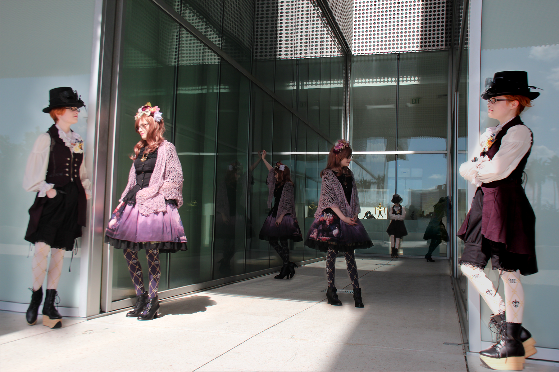
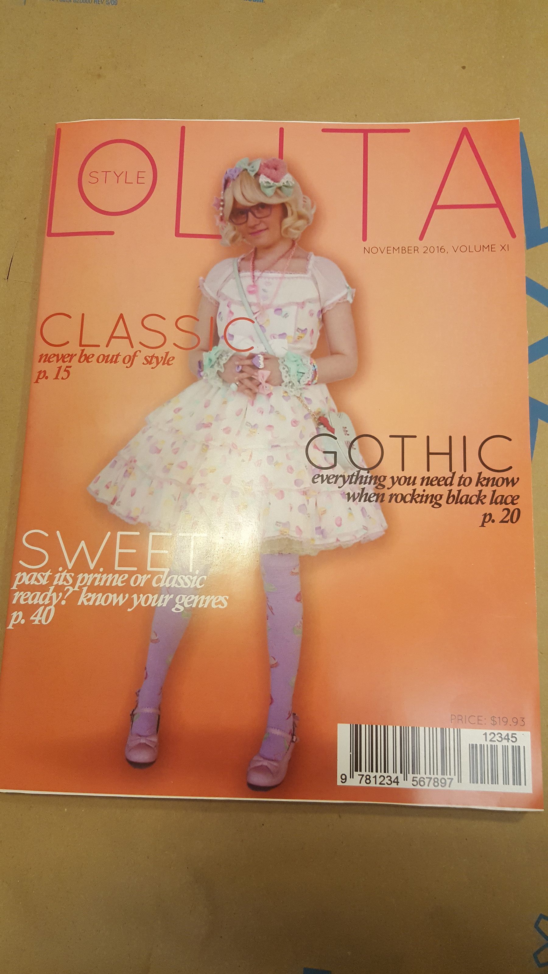
This latest art project was to create a fictional magazine cover, of our own idea and design.  I thought of four different concepts, but settled on another idea I had to showcase Morgaine and her Lolita style.

“Lolita” is a niche fashion style from Japan styled after Victorian and Edwardian era clothing.  Lolita fashion has no ties to the same-named novel by Vladimir Nabokov, nor does it have any of that story’s connotation.  To learn more about the Lolita FASHION culture, here’s a good link.

img_1207
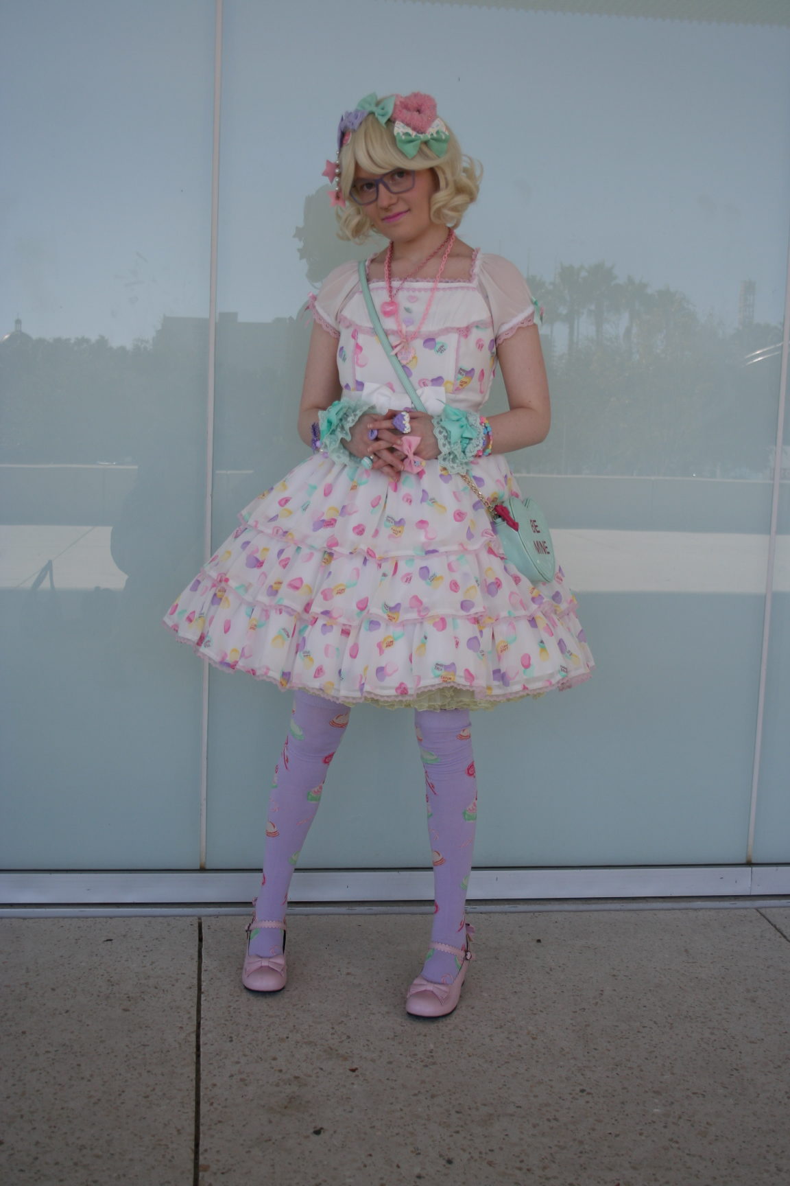
Once again I asked Morgaine to pick out one of her wardrobes and I toted her downtown to shoot some poses outside the Tampa Museum of Art.  It was a sunny day and I wanted bright, but not direct sunlight.  That location has lots of high overhangs and frosted glass panels to reflect lots of natural light, but no direct harshness.  It’s like semi-shade everywhere.

I also wanted to create a masthead style that would be recognizable as a fashion magazine but unique, minimal and modern.  The element of the reduced-size O, with the word “STYLE” inside developed over a couple of days of tinkering.

masthead

Once I settled on the masthead, I followed with styling the article titles, spine and other miscellaneous pieces.  The price, $19.93 is Morgaine’s birth year.  The bar code was generated by an online bar code generator with its defaults, TEC-IT.

Masking, a soft peach color scheme with a very minor radial gradient, soft shading and some adjustment layers completed the cover.  I extended the cover’s background color to the spine for continuity.

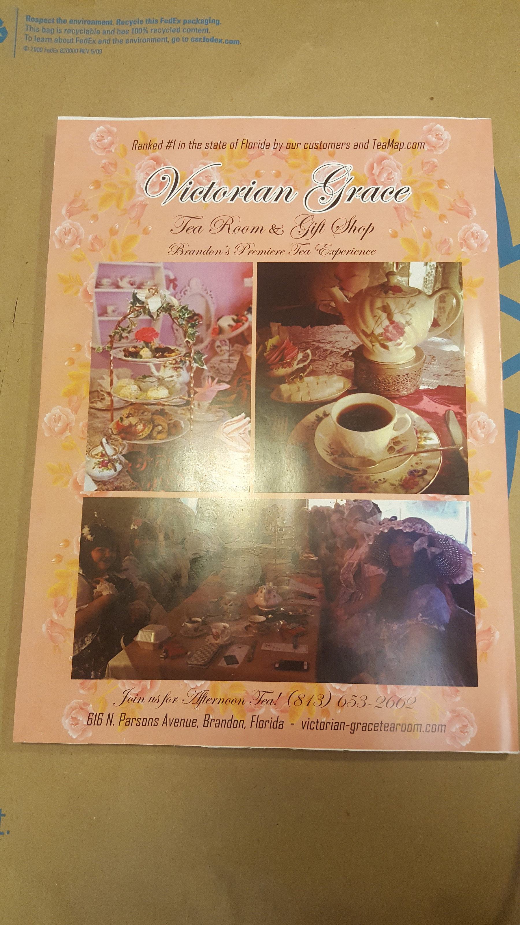
This project also has a back cover, and that was to be a simple advertisement for something related to the magazine.  I put together a simple advertisement for Morgaine’s favorite Tea Room, coincidentally located in Brandon, close to where we live – The Victorian Grace Tea Room & Gift Shop.

lolita-style-cover

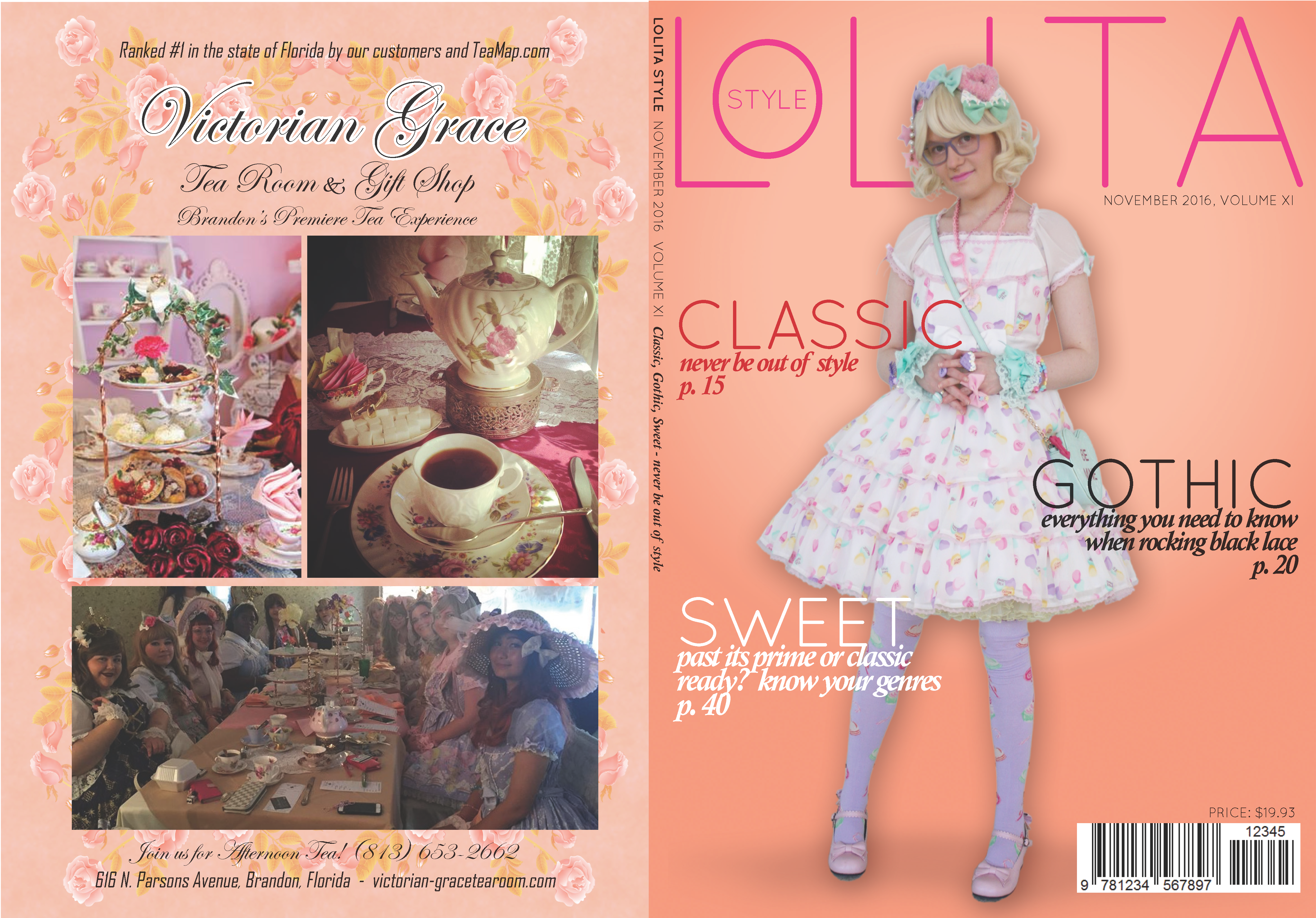
I ran the finished PDF over to Kinko’s to print – I had planned a scant few millimeters over-print so I could mount the finished cover on a Glamour magazine.  Wouldn’t you know it, the Kinkos attendant didn’t print all the way to the edge of an 11 x 17 sheet of paper.  My overall design was 16.25 x 11, with maybe 1/8 inch to trim off (planned) – but the finished product left a sliver of white on the covers.  I’ll take a hit on that, but it’ll have to do because I’m out of time.

finished-cover back-cover

The finished product came out pretty well – to attach the cover, I first used double-sided tape on the spine after I had the cover lined up.  Then I used spray adhesive on the front and back covers to make it permanent.

Art Nouveau: Beverage Label…

In Digital Art we briefly explored the Art Nouveau genre, and our next digital art challenge was to make a beverage label in the Art Nouveau style.  I really enjoy this genre, with its soft colors and articulate drawing combined with subtle shading.  Art Nouveau is mostly “flat” with realism coming from detailed subtle pen lines – something I am horrible at – I tend to lean towards the impressionist side of things.  Big swaths of color with no boundaries.  I like to color outside the lines…

Fortunately, with a little trickery in Photoshop one can turn just about any photo into pseudo line-art, so monkeys like me only need to worry about coloring.  Typically one uses the selection tool, selects an area, then fills.  Mostly I like to go freehand with lots of layers, switching back and forth between brush and eraser, or masking back and forth.

meade2
Yes, that’s real mead, courtesy of Hidden Legend Winery, Victor, Montana.

For my subject beverage, I chose mead.  Honey wine.  The oldest known beverage of its type.  And, since we got our Flowhive, I’ve been researching how to make mead in small batches.  A quart of honey will produce a gallon of mead….so once we get our hive rolling, I’m expecting we’ll get enough honey to make a few small batches of mead…just because we can.

I grabbed a bottle (two, actually – one for my art assignment and one for Whit).  I wanted to see how my design ideas would complement a real bottle, so I decided not to go with an empty.  The title “Harvest Moon” popped in to my head, probably because of this weekend’s “super-moon” and all the noise about it in the news.

One characteristic of Art Nouveau is classically beautiful women in typically alluring or sensual poses.  This intent was not “just because” but often because much of this period work was commissioned for advertising.  Sex sells.  Fortunately, I know a classic beauty or two…I asked the timeless Denicia Conley if I could troll her Instagram feed for a suitable photo (first making sure she’d be okay with contributing to my art assignments).  She had modeled for some local designers, so I was pretty sure I could find something suitable.

harvest-moon

I thank Hidden Legend Winery for the use of their Pure Honey Mead (it’s a five-star rated mead, BTW) and my pal Denicia Conley for allowing me to get artistic with one of her photos.  As always, feedback welcomed.

Multiplicity…

donscottmultiplicityThis latest assignment focused on Photoshop, working with layer masks.  This was a fun project because ERASING is strictly forbidden (automatic fail).  All work must be done using layer masks, adjustment masks, etc.  I’ve been working with layer masks for quite a while, but I learned several new techniques for this exercise, which made assembling this composite photo happen quickly.

Prof. Tortorelli stressed that he wanted an interesting composition, but be very careful with lighting, so this shoot should be outdoors.  I just love all the different modern architecture around Curtis Hixon Park – it was actually really difficult to choose where to shoot – there are so many great spots around the Tampa Museum of Art.  I settled on a glass alcove at the museum.  Prof. Tortorelli will probably poke at me about the lighting – it became a challenge with clouds moving across the sun, but it was also really interesting with reflections and shadows in that space.

I took maybe 40 photos of Morgaine moving around and posing in the space, and she changed outfits halfway through.  As I was putting the composite together, a little story started to emerge around Morgaine’s poses.  The eye seems to flow from left to right on this piece, and it tells a story of a relationship, starting together but frail, breaking apart, then two individuals standing alone, but undamaged, ready to move on.  That’s what the final photo was telling me.

I really enjoyed doing this piece, and while it seems like it would be difficult to do, it was really quite easy using Photoshop’s massive array of masking tools.

Photo Restoration…

The latest project in Digital Arts was to use Adobe Photoshop to restore an EXTREMELY damaged photo.  Finding a photo was somewhat of a challenge, so I did my own damage.  A photo on the ‘net really struck me – it’s a rather famous piece from artist Sally Mann, done in 1989.

Candy Cigarette, Sally Mann, 1989

I cropped it to 4 x 6, then printed it in high quality.  Then I mangled it (sorry, Sally) to get an interesting photo that I could restore.  I then re-scanned the pieces at 600 dpi and got to work.

Obviously the restore is not perfect, as you can see from the original.  Scanning the pieces caused slight differences in the shading, and working at the “pixel level” was a challenge, but I enjoyed the work.  I think it turned out fairly well, but certainly could not pass as an authentic replica of the original.

Candy Cigarette, Sally Mann, 1989.  Restoration before and after.
Candy Cigarette, Sally Mann, 1989. Restoration before and after.

Propaganda…

My propaganda poster is an obvious choice.  Most of the symbolism is also quite obvious, but I wanted to point out a couple of things from my older generation.  Atop the flag-pole is the old USSR hammer and sickle symbol, pointing towards a return to our past (making America great AGAIN) – really, decades prior have not been greater than these.  Much of the social issues we are tackling today were behind closed doors in our past.  While we have a long way to go, I feel we are much more tolerant than we were in the past.

“Slave Leia” – in my generation, that image was the epitome of female denegration and abuse.  Princess Leia, the most virgin and pristine example of intergalactic womanhood was sold and abused (likely sexually deflowered) by Jabba the Hut and his cretins.  Every adolescent male in my generation wanted Jabba the Hut to die a thousand deaths for enslaving  Princess Leia in chains.  This image was a good one for that reason.

Credit to ArtbyBones for Leia image:  http://artbybones.deviantart.com/art/Slave-leia-154852538

Credit here also for the demon background (live-traced):  http://www.goodfon.su/download/dahaka_the_beast_of_time/1920×1080/

Project #4 – Logos

donscottlogosWe were challenged to create three logos for three separate companies/efforts, following the basic principles of design. All three logos were created in Adobe Illustrator:

The first logo, “New Day Solar Panels” was done using basic shapes, patterns and gradients. I also used Illustrator’s Perspective Tool (2 point) to achieve the 3D effect and align the title text properly.

The second logo, “World Domination Productions” is a real LLC used to produce and release music for Chris Duarte (http://duarte.rocks). This logo was playing with shapes, while Chris Duarte’s early muse for playing music is rooted in the iconic “Fiddler On The Roof,” hence the silhouette.

The third logo, “Nature’s Remedy” is for a fictitious marijuana dispensary. Here I wanted to play with negative space and a simple recognizable design, similar to something like Starbucks coffee.

Calligram

My first real “hand it in” art project in more than 30 years.  The last time I did anything to be graded was in High School – that was 1983. Yikes!  Prof Tortorelli set us to task, and this was all about learning text manipulation using Adobe Illustrator.  He also declared “I don’t care what your major is…in this class you’re all ARTISTS!  And I want you to push yourselves as artists.  Make yourselves uncomfortable.  Push the boundaries.”  Music to my ears.

I sketched out three proposals – two were political, and one was just plain risky.  It was uncomfortable.  A classy nude.  That was it.

60caf36c9d42dcd215ec5ad8444b7d8e
The original photo

I started with a random photo from the ‘net.  Obviously there’s a plethora of material to choose from, but I set Google’s search sights on “nude torso black and white.”  The sixth photo in the search spoke to me immediately.  I searched all over the ‘net for the photographer so I could ask to use this piece, but all I found was “photographer unknown, model unknown.”  I don’t know who you are, but thank you for your work.

second-one
Posterized to six shades

With so much shading, I needed to figure out how to overlay words/phrases in a consistent way, so I threw the photo into Adobe Photoshop and ran a “Posterize” filter with six layers.  This gave me the foundation to begin.  After posterizing, I converted the image to vector paths in Illustrator, which smoothed things out quite a bit.  I thought this would be an “easy” task of selecting a vector shape, doing some copy/paste work, then using the “Object-Envelope Distort-Make With Top Object” function to quickly fill in the form.  Not so much.  I started working from bottom to top, and you can see some bottom areas are a bit quirky while I was trying to work out the best processes to overlay and distort the words to follow the form.
 

work-in-progress-2
The graded piece

Time ran out on me last week, so I handed in what I could for a grade.  I thought I was close to being finished, but I was really only about half-way done.  At this point, I had 173 layers in Illustrator.  Although I had handed the piece in for a grade already, I wanted to finish this first work.

I primarily used this technique in Illustrator:  Draw a path following shapes/contours using the Pencil tool.  Insert words/phrases using the Type On Path tool, adjusting font sizes, etc to fit the path.  Stretch, warp, fill the area using Envelope Distort – Make With Mesh, modifying the mesh rows & columns according to the overall shape I was trying to fill.  After modifying the text, finish with a shade of color.  I used the “beach” color palette, as that gave me some consistent colors to add just a bit of pop (lips, breasts and belly button).  

8-5x11-working
Finished in Illustrator

I thought about going crazy with multiple colors and shades, but I thought it would lose class if I turned it into a “paint by numbers” project.  While the “words” were done, I felt that it was too “sharp” and needed just a bit of shading to soften it up.  For that I used a technique I learned when doing my Chris Duarte posters a while ago.  You can see the series HERE.  I used a Photoshop Displacement filter, with the top layer (the words) set to blend as a linear burn with the bottom layer, the original photo that was Gaussian blurred and modified with more brightness and contrast.  And that was that.  Done.

8-5x11-v1
The final version

So there are a lot of words and nothing repeats.  Where did all that come from?  Many thanks to Pandora’s streaming service.  I set the station to “Muse” and simply re-typed/modified lyrics for the hours that I was at this project.  I finished with 351 Illustrator layers, then an additional couple of layers in Photoshop for the Displacement filter.  This work was an estimated 20 hours sitting in front of my PC over the past several weeks.  I loved it.

HTML Canvas homework…

This was a bit challenging, especially since I overlooked the linear gradient error note in Prof. Tortorelli’s email.  That killed about 30 minutes.  I also didn’t quite understand the closed shape – mine wasn’t symmetrical, but I was also just playing with the coordinates/variables.  I also messed around with the order of rendering shapes to get a funky background and the looping lines effect.

DonaldScott.canvas

Here’s a link to my HTML code/page:  DonaldScott.canvas

ART 210 L2 – Day One

I showed up to class a few minutes early (18 minutes?) and probably should not have strolled right in, but I did, and took a seat way in the back…  Professor Tortorelli seemed really laid back – he just let me waltz right in and take a seat after saying hello and confirming I was in the right place…although early.

I realized pretty quickly that this class was already deep in the throes of a lesson, and looking to end soon.  I looked up on the display and saw some basic code in Dreamweaver.  Holy crap!  First day, coding in Dreamweaver, hard-coding lines, rectangles and curves.  These must be some upper-level geeks!  “Wow…what class is this?” I thought…  That class ended with a review of homework (a blog) and a couple other administrivia notes…and I realized it was the same class I was taking.  AWESOME!  We’re gonna code right from day-1!  I’m excited.

“My group” comes in and we dive right in.  Log in to our workstations, go to the shared drive and review the lesson.  The coding turned into more of a copy-paste exercise, but that’s okay, I felt more at home in this hands-on environment.  Ready to rock-n-roll.  I also noticed the amazing array of power tools at our disposal.  First time I’ve ever seen Audacity (MP3 splicer/mixer/editor) outside of my own computer.  Excellent.

Prof Tortorelli also told us he’d unlock the secrets of the Illustrator Pen Tool…that, in itself, is well worth the class.  The Pen Tool is still a mystery to me, after several years of tinkering in Photoshop…and I stayed away from Illustrator because of that damned Pen Tool.  Bring it!  I’m expecting big things from this class.